

- Location Houston
- Dates Completed 2021
- Size 32,000 SF
- Project Cost $75/SF
- Contractor KDW
What once was old is new again! Kavi Properties needed to give their class C office complex more than a face-lift to attract and retain tenants. The four Houston area buildings from 1982 felt disconnected, dated, and dark. Master planning is our middle name, so we got to work on concepts that would appeal to the tenants, the landlord and the budget.
This multi-phase project began with a pedestrian-friendly concept to connect the four buildings via pathways and outdoor seating areas. The exterior facades were refreshed with a new color scheme, awnings, and signage.
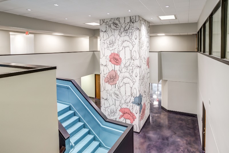
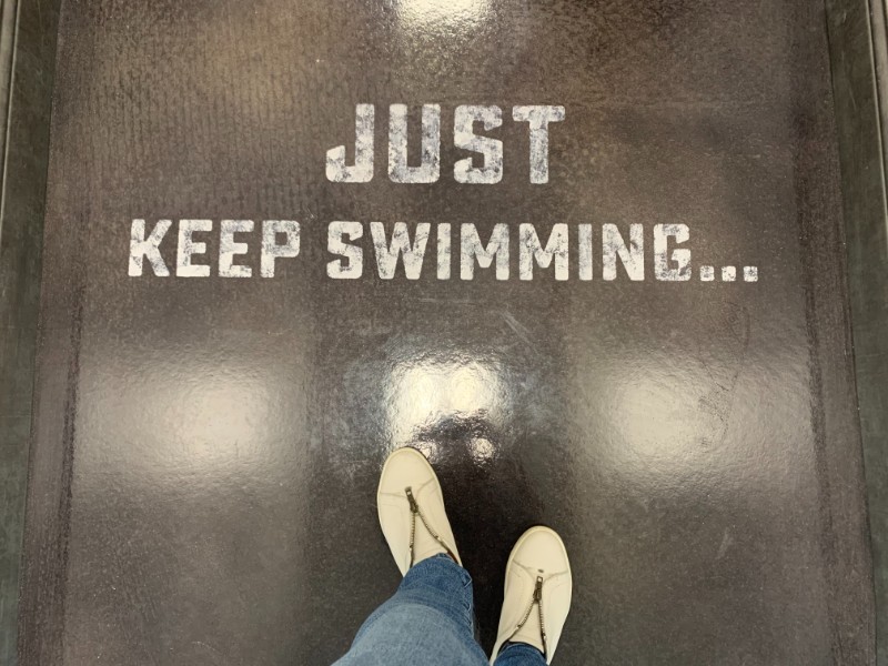
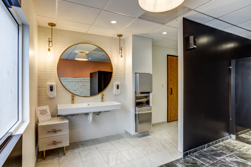
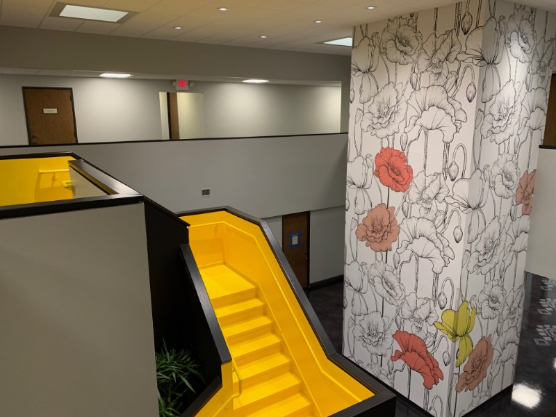
The public interior spaces received a vibrant color scheme specific to each building as well as new amenities like smart vending machines. The refresh included new ceilings, floors, walls, lighting, and plumbing fixtures. Our extended team created custom graphics for each building, including large-scale wallpaper for each elevator lobby. Bright, fresh and fabulously fun, these buildings are the talk amongst the office tenants.
***As of 2022, the client has been able to increase rents by almost 20% – proof that the RIGHT design can give you a big ROI.***